
I have been engrossed by a LiveView project recently at work. The project involved taking the provided designs and implementing them into a functional application (the usual.)
I decided to split each constituent part into a LiveView component. This is both for reusability and for reducing the complexity in each file.
One of the components is a datepicker. You’ve seen these before, if you want to make a reservation for a flight or a hotel for instance. The requirements are: start at today’s date, be able to select another date in this month, or view other months and select dates from them. Sometimes there are limits to how far back or forward you can navigate. HTML even has a spec for this so your browser handles it natively now.
Why not use the HTML input?
Great question! My primary reason is the design.
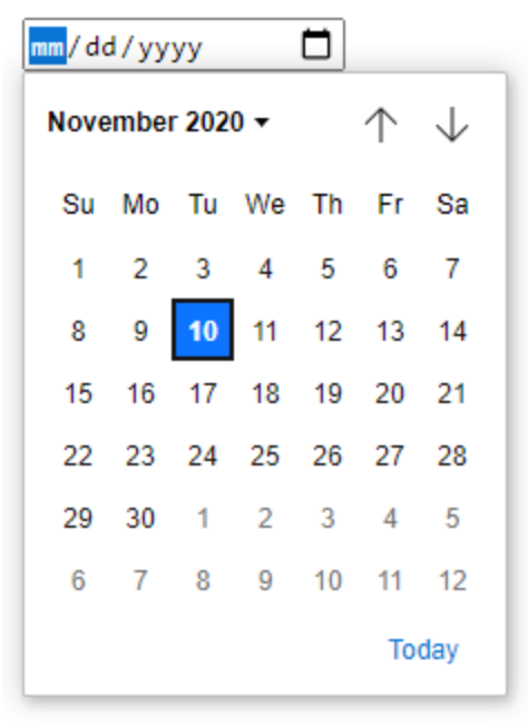
Every browser implements the datepicker elements in a different way, and control over their styles is still somewhat limited. I think I could have gotten most browsers to look close to this design, but I doubt I could ever make them look and act exactly as the design dictated.
Another advantage to making a custom component is having callbacks on every event. For instance, if you wanted to perform an action when the user navigated to the previous month.
Using the component
Including the component in a LiveView requires one line of code and 2 variables being passed in.
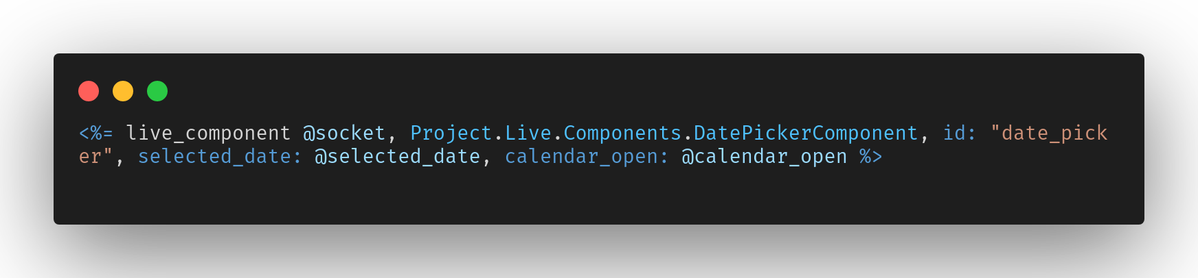
Every LiveView component requires a unique ID. In this example I am using a very generic ID, but if you are planning to use more than one on a page you will want to use a more meaningful ID.
The component also needs to know what the selected date is (you may default to today’s date) and a boolean of whether to default the month view to open or closed.
Callbacks
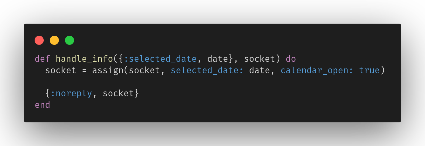
When a component is loaded, it calls 3 callbacks; preload/1, mount/1, and update/2. After the initial load, only preload and update will be called again.
For the datepicker, those callbacks look like this:
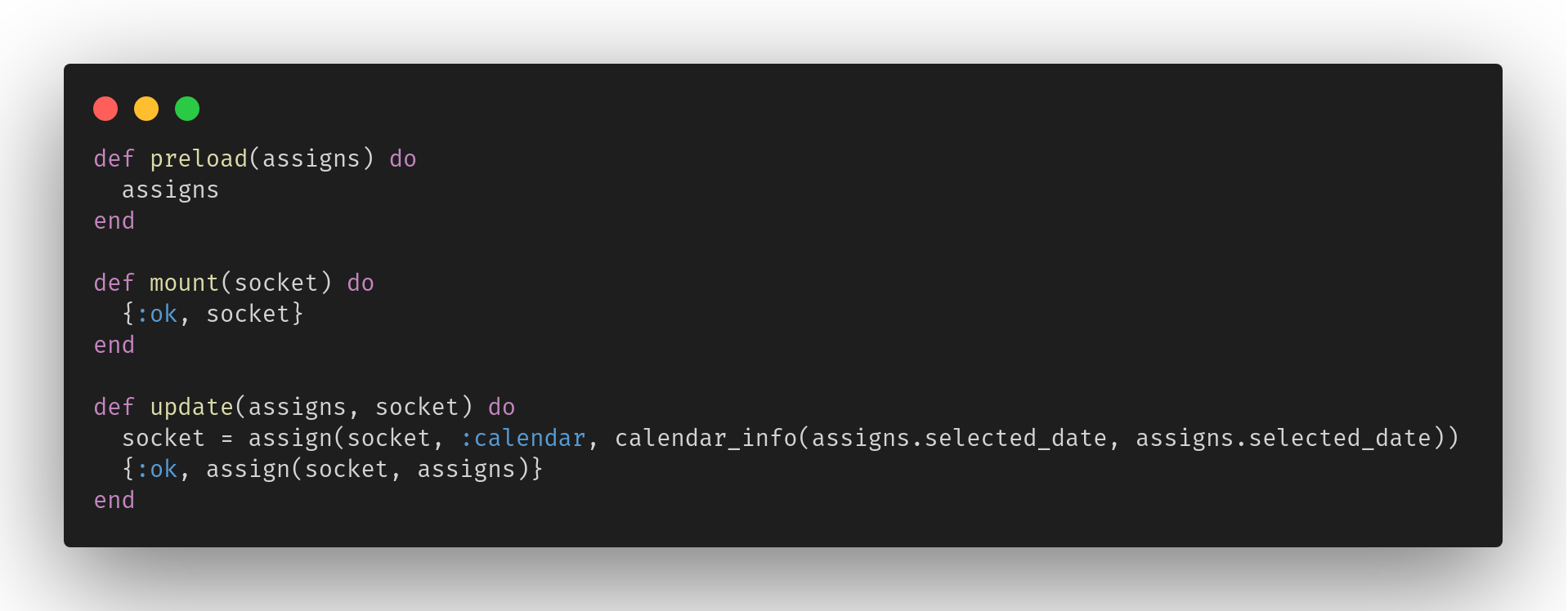
In this component the preload and mount don’t do anything. The socket is updated with the calendar info in the update. The preload callback is important for some components for optimization, but not this one since the socket updates ar rather trivial. I recommend reading more about this in the documentation.
Custom functions
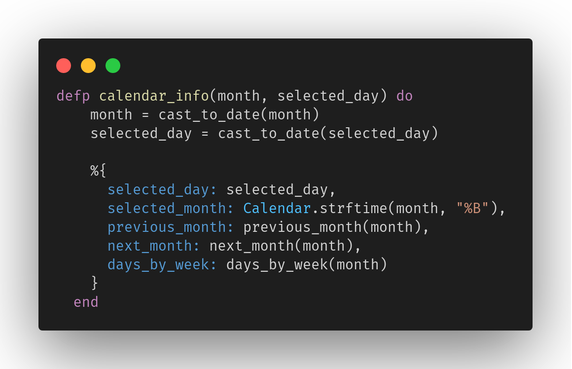
The calendar_info/2 function builds a data structure with all the parts we need to update the template. (Link to the full code at the bottom.)
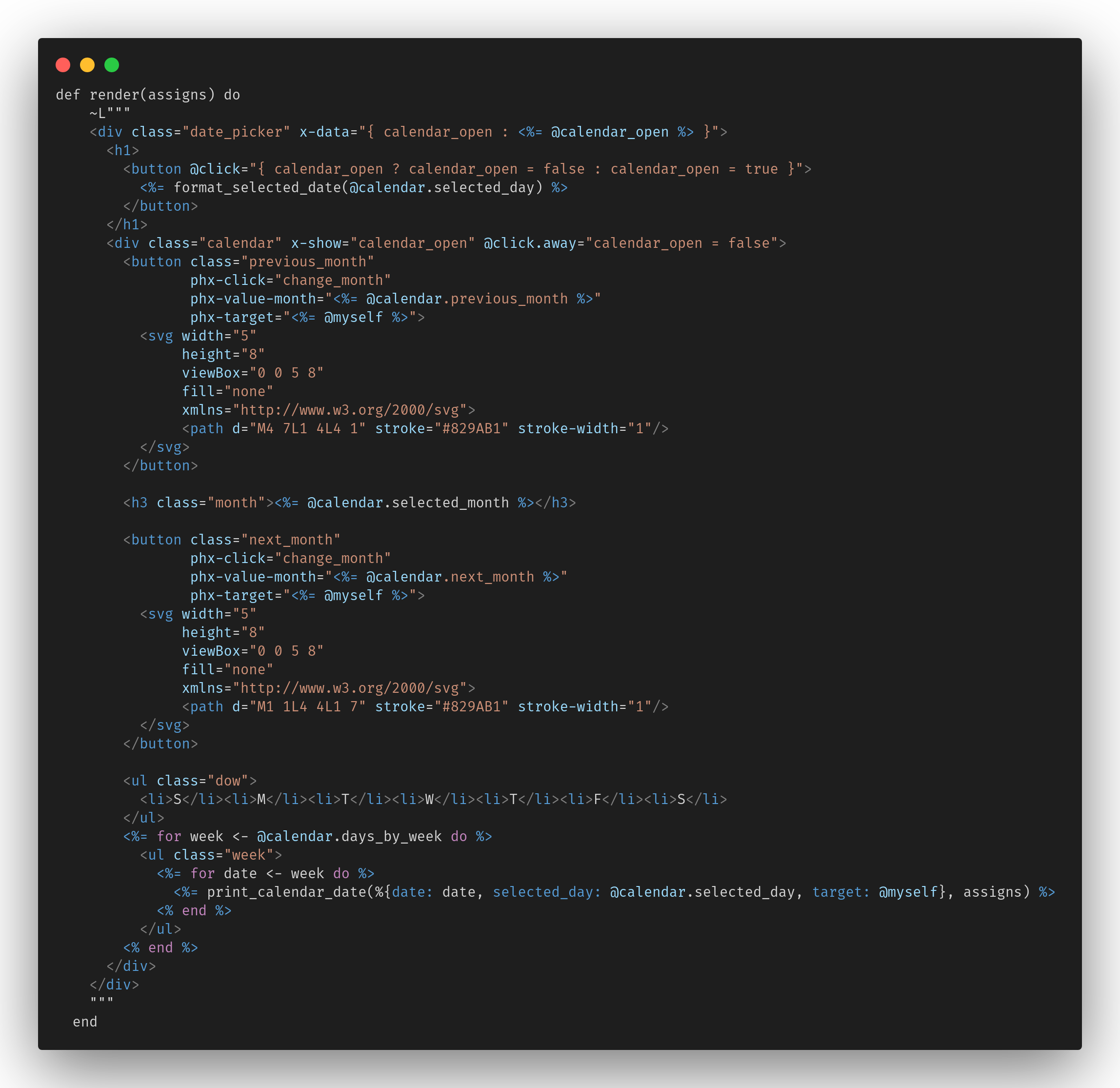
The component template looks like this:
Events with AlpineJS
The outer-most container has an x-data attribute defined. That is used by AlpineJS to manage the open/closed state of the monthly view.
The H1 shows the selected date and is a button that triggers opening and closing the month view. It uses the ALpineJS @click listener which is setup to toggle the view state.
Next is the calendar container. It is bound to the calendar_open property using the x-show listener. And uses the @click.away listener which tells it to hide when the user click on anything outside of the element.
LiveView Events
The previous month and next month buttons use the phx-click listener. This will send a message to the LiveView. By default, the message will be sent to the parent LiveView. It was important to me for the components to be reusable and as self-contained as possible. Adding the phx-target="<%= @myself %>" tells the component to handle the event locally.
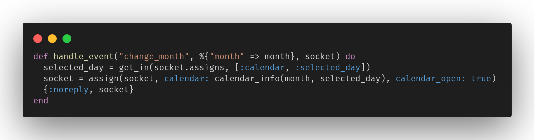
That event is captured in this callback. The first argument is the name of the event (set in the phx-click.) The second are the values sent as a map. Notice that phx-value-month = <somevalue> becomes a map %{"month" => <somevalue>}. And the last arg is the current socket. State changes for LiveViews are stored in the socket.assigns, so you’ll notice we are always passing around the socket.
That covers changing the month, but just as important is being able to select a date. The calendar data structue is broken up into weeks. Most of the weeks are a list of 7 dates, but for weeks at the beginning or end of the month they may contain nil values too. Every week has a length of 7, so if the first of the month is on a Tuesday, the list for that week will start with 2 nil values followed by 5 days.
So, a date can be represented in 3 states; the nil state, the clickable date, and the selected date.
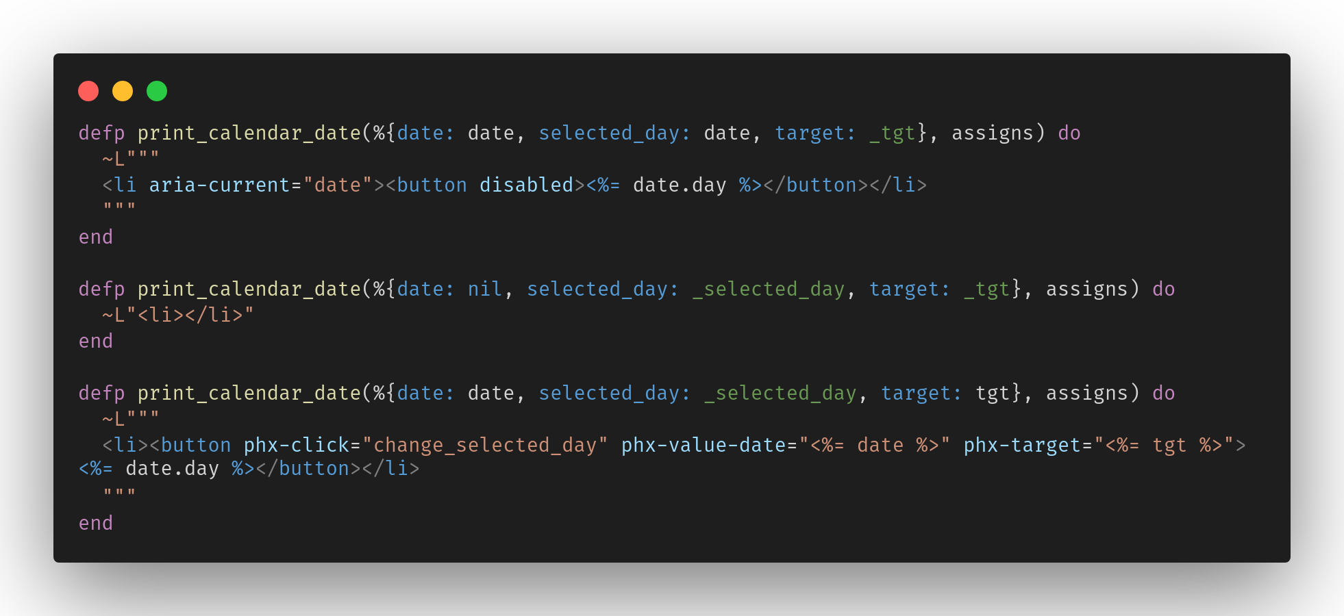
Clicking on a date calls the handle_event callback which updates the socket.
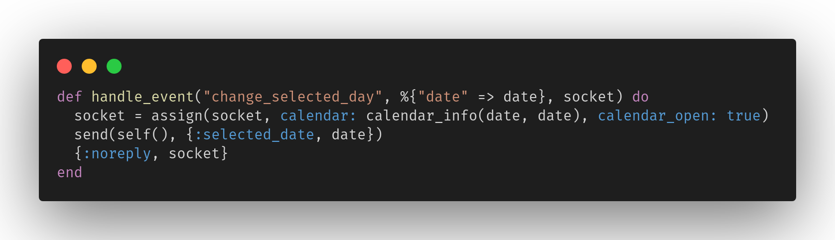
That callback sends a message to the parent LiveView as well.
Styles
The component is all styled in an scss file. TailwindCSS is often used inline, which is fine too, but I prefer the styles to be organized in a separate file. I don’t think there is a right or a wrong way, just whichever you and your team prefers.
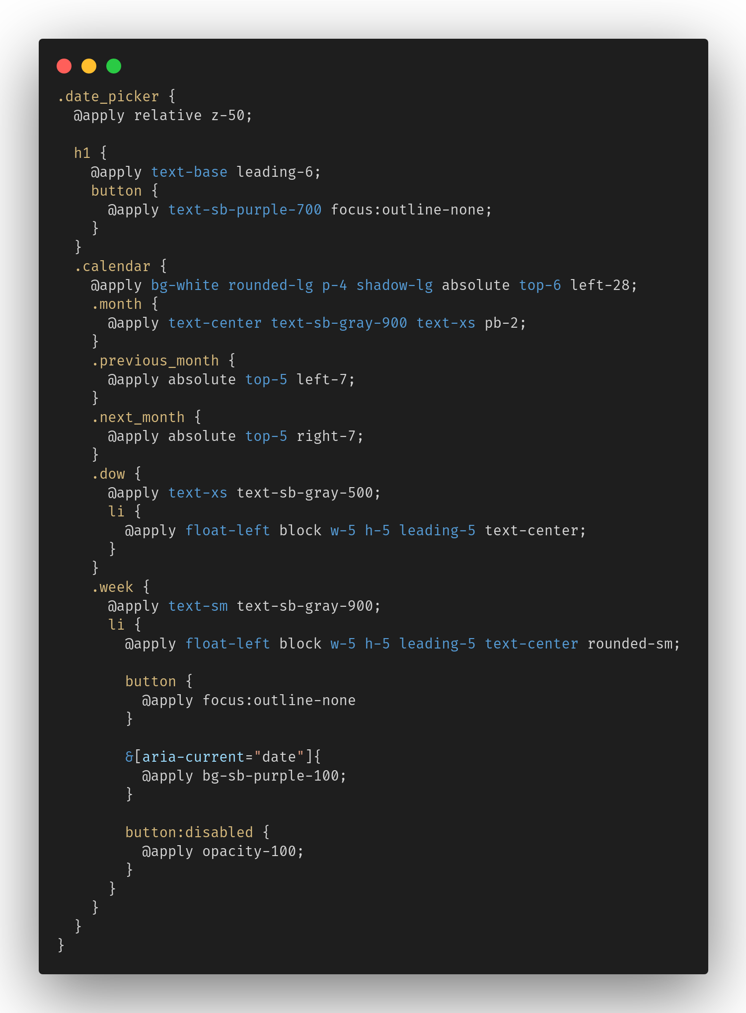
As you can see, TailwindCSS covers a lot of ground. From size and color, to shadows and rounded corners, and more. If you aren’t familiar with accessibility (a11y) you might not have seen the aria-current attribute. It is used in this case to indicate the current date, but it is also a great selector for CSS to change the style of the current date. For the datepicker, it makes the background of the button purple.
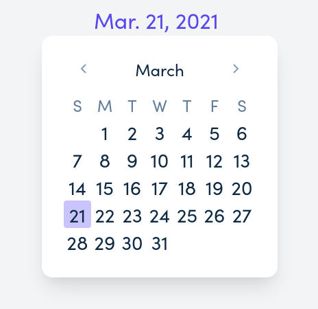
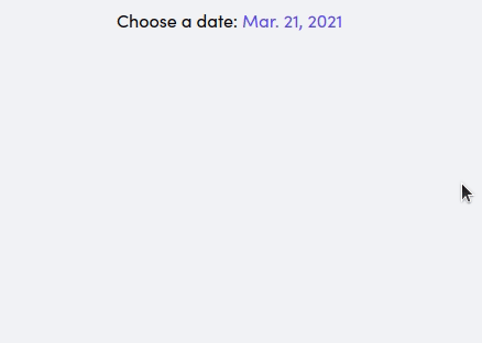
The final product:
Thanks for reading, you can see all of the code on GitHub